Creating a Responsive React Native App

While using apps on different screens, you always want to get a responsive layout. While using the React Native framework, there are certain ways to achieve responsiveness.
If you are one of the aspiring React Native App developers struggling to get your app responsive, then consider this blog as the proper solution.
Before going into the main approaches or steps, let’s understand,
What Actually is a Responsive App?
The word ‘responsive’ used with the word ‘app’ implies that the app is constructive even if it is run on different screens, orientations, and platforms. For the app to be responsive, you need to build, you need to design flexible images, grids, and layouts. To attain responsiveness, you have to focus on the app’s UI. With no responsiveness, the utility of the app will reduce.
In other words, when you run a React Native App (not responsive) on different screens, you cannot get consistent images, texts, and other elements rendered on the app screen.
So, let’s see what are the possible approaches to create a responsive app. Also, you will get the snippets of output after I build responsive apps.
Pre-acquired learnings under consideration
You need to set your development system as per the React Native environment. As we are working on the React Native framework, we need to get all the software, dependencies, and packages.
If you are yet to set up the system and looking for a reliable guide, you can reach out to react native app development company for the services for the Environment setup.
The other thing that you need to learn is to build a React Native app. Why you need to learn the steps of Creating a React Native app because responsiveness is a feature that you have to add to your app.
Making responsive apps is not something about creating apps from scratch but integrating features like flex, dimension, and others. Check this tutorial blog, if you are new to React Native framework and want to learn about the steps.
In this blog, you will see three different approaches: React Native dimensions, Flexbox, and percentage dimensions to embed the feature of responsiveness to your app.
Considering the Dimension approach
Refer to dimensions as the core React Native components. Using the dimensions, you can set the width and height of the app as per the screen on which you are rendering the app.
For that, you have to import the component Dimensions from react-native library.
Also, in your codebase, you have to add the following syntax.
const windowWidth = Dimensions.get(‘window’).width;
const windowHeight = Dimensions.get(‘window’).height;
If you don’t want to add both lines and combine these two lines into one, you can consider the following code lines instead.
const {height, width} = Dimensions.get(‘window’);
This will provide you with the reference width and height of the device screen.
Let’s see a real example.
import React, {Component} from ‘react’;
import {View, Text, Dimensions, TouchableOpacity} from ‘react-native’;
const {height, width} = Dimensions.get(‘window’);
class App extends Component {
render() {
return (
<View
style={{
flex: 1,
alignItems: ‘center’,
justifyContent: ‘center’,
backgroundColor: ‘blue’,
}}>
<View
style={{
width: width – 60,
height: height / 3,
backgroundColor: ‘yellow’,
justifyContent: ‘center’,
alignItems: ‘center’,
}}>
<TouchableOpacity
style={{
backgroundColor: ‘#a9a9a9’,
alignItems: ‘center’,
width: ‘60%’,
height: 40,
justifyContent: ‘center’,
borderRadius: 25,
}}>
<Text>Life is a mess!!</Text>
</TouchableOpacity>
</View>
</View>
);
}
}
export default App;
Here, I have created an app with a text element: Life is a mess! To show the responsiveness, I will run the app on three different devices: the web (on a laptop screen), the iOS phone, and the Android phone.
To run the app on the web or your system screen, you can use Snack explorer. And for the Android device, I have used the Expo app to run the app and test the same.
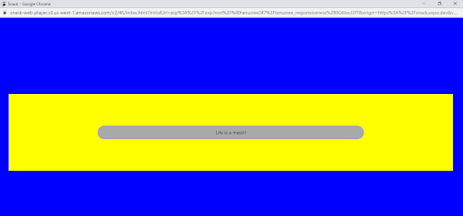
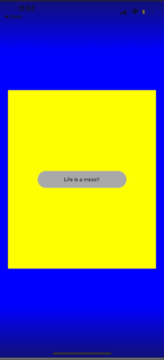
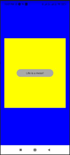
As you can see, the text elements and the yellow box are consistently presented on different screens. Also, the container which holds the text has a responsive design for different screens.
Now let’s cover the second approach of React Native flexbox.
Using the approach of Flexbox
Refer to Flexbox as a type of layout. You can use this to design different UI. You can also get a consistent and responsive UI using the Flexbox method. The properties that you use with the Flexbox method are flex, flexDirection, and justifyContent.
Flex defines the space covered by an element. In the following example, you will see different elements container, content1, content2, content3, and content5. It will have different flex, which means that it will cover different proportions of the available space.
Another property flexDirection defines the direction in which the element is placed. It can be horizontally or vertically.
justifyContent is another property used in the Flexbox method. It is used to specify the alignment of the element along the prime axis.
Now, let’s have a look at the codebase
import React from ‘react’
import { StyleSheet, Text, View } from ‘react-native’;
const App= () => {
return (
<View style={styles.container}>
<Text style={styles.content1}>cat</Text>
<Text style={styles.content2}>dog1</Text>
<Text style={styles.content3}>parrot</Text>
<Text style={styles.content4}>fox</Text>
<Text style={styles.content5}>elephant</Text>
</View>
)
}
const styles = StyleSheet.create({
container: {
flex: 6,
flexDirection: ‘column’,
backgroundColor: ‘black’,
justifyContent: ‘space-around’,
textAlign: ‘center’,
},
content1: {
flex: 5,
backgroundColor: ‘yellow’,
textAlign: ‘center’,
},
content2: {
flex: 4,
backgroundColor: ‘grey’,
textAlign: ‘center’,
},
content3: {
flex: 3,
backgroundColor: ‘crimson’,
textAlign: ‘center’,
},
content4: {
flex: 2,
backgroundColor: ‘white’,
textAlign: ‘center’,
},
content5: {
flex: 1,
backgroundColor: ‘green’,
textAlign: ‘center’,
},
});
export default App
Here, the FlexDirection is set as a column, and justifyContent is set as space-around.
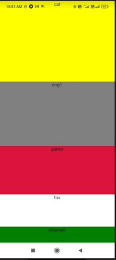
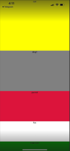
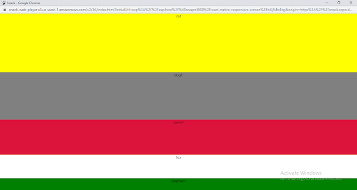
Now, we will see the output for this code in three different devices. Image 4 denotes the output for an Android mobile device, image 5 is for an iOS device, and image 6 is the output displayed in the website window. As you can notice, with flexbox, you can get the response layout whatever the screen size is.
Considering the method of Percentage Dimension
You have been using the whole values for width and height. Right? But now you need to use the percentage method. What is the difference between using whole values and percentages? With the whole values as the element’s width and height, your code becomes restricted; however, with the percentage value as its width and height, it becomes much more flexible. While using the percentage method, you are using the reference method.
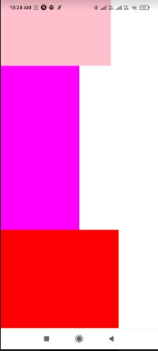
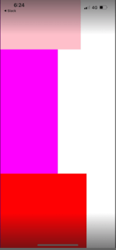
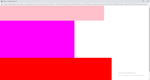
In the following codebase, you need to stretch the height of all three color elements and for this set the height of the entire container as 100%. Also, set all the values of width and height in percentage. Let’s see how you can execute this.
import React from ‘react’;
import { View } from ‘react-native’;
const App= () => {
return (
<View style={{ height: ‘100%’ }}>
<View style={{
width: ‘70%’, height: ‘20%’, backgroundColor: ‘pink’
}} />
<View style={{
width: ‘50%’, height: ‘50%’, backgroundColor: ‘magenta’
}} />
<View style={{
width: ‘75%’, height: ‘40%’, backgroundColor: ‘red’
}} />
</View>
);
};
export default App;
Rather than using the whole values as the width and height of the color elements, I have used the percentage value.
Let’s check the output on three different screens. below images are the output rendered in the Android device, iOS device, and web.
Now, I hope it has become easier for you to build a responsive layout for your next React Native app.


